Posted at 05 Aug 2014 10:35h
in
Client showcase
by Jeff
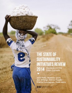
The State of Sustainability Initiatives Review is a massive report, created every four years, by the International Institute for Sustainable Development, one of Talk Science to Me's oldest clients. We were asked to copy-edit, design and proofread this epic masterpiece, weighing in at 365 pages. The design portion of the project, with its more than 400 figures, tables and images, was mine.
 The SSI report, which evaluates voluntary sustainability initiatives in 10 major agricultural crops, is a massive undertaking of research and writing, and my task was to honour the content and create a logical, readable, accessible—i.e., well-designed—version for our client’s readers, which include experts in the field, laypeople and the media.
The central problem in the design process, which had to be completed—including working with the proofreader—in about a month, originated from a seemingly non-design-related question: who was providing content, and when were they delivering it?
Solve that problem well, and the report would be better designed for it.


 The SSI report, which evaluates voluntary sustainability initiatives in 10 major agricultural crops, is a massive undertaking of research and writing, and my task was to honour the content and create a logical, readable, accessible—i.e., well-designed—version for our client’s readers, which include experts in the field, laypeople and the media.