Decoding the logo 2: Ancestry
I’ve described in an earlier post what our current logo looks like and what all three images actually are. But we also have some specimens around of ancestral forms. Like any brand identity, the design process involved a lot of back-and-forth and extensive prototyping before the decision was made to commit to one version. This was all before my time, so I thought it was very cool to see documentation of those steps.
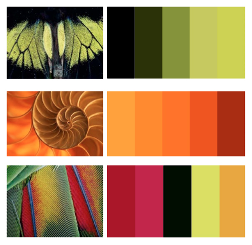
First, here’s a neat jumping-off point created by Aine McDonnell, the talented designer who developed our brand. It’s a collection of colour swatches derived from living organisms. This was a brainstorming technique to get some direction before there was a clear idea of what the logo itself would look like. The final colours are pretty close to shades found in the lower two options.


 This is, of course, a cephalopod. An octopus, to be specific. Octopuses (